top of page

BRANDING | PACKAGING
A rebrand for Lumist, a next-generation advanced teeth whitening strips. It is effortless to use and can be worn while you exercise, drink, and talk.
The challenge was to create sophisticated and trustworthy teeth whitening strips that attract millennials.
The logotype has 3 circles that are fading to imply how Lumist whitens teeth. The logotype also italicized to indicate how fast the formula works. It dominantly utilizes mint color because Lumist has a mint flavor and to stand out from other competitors such as Crest and Colgate, which dominantly use blue and red.


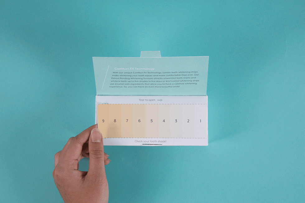
To keep track of the progress, the box includes teeth brightness scale that needs to be torn to open up the box.
bottom of page